
Reader Survey Responses: NPS vs Product Market Fit
I asked my readers to do an NPS _and_ Sean Ellis Product-Market Fit survey for my daily lists. Here are the results.Last week I ranted a bit about NPS, then so-called Net Promoter Score. In that rant, I suggested one possible alternative, for a certain type of market research, is Sean Ellis’ Product-Market Fit Survey. I thought it would be fun to do my own NPS and PMF surveys and compare results. So I asked you, my readers, to do a survey about this list. 20 of you responded.
Today I’ll share the NPS and PMF results of that survey, and offer my observations.
First the click-bait headlines for each:
The Daily Commit has an NPS score of 36, aka “favorable”
The Daily Commit has a PMF score of 15%, aka “needs work”
So let’s break these two results down a bit, and see if we can learn anything interesting from either.
NPS of The Daily Commit
Recall that NPS consists of a single question, on a scale of 0 to 10 (10 being most likely):
How likely is it that you would recommend The Daily Commit to a friend or colleague?
Only 19 of 20 respondants answered this question, and of those 19 respondants, the precise score is 36.8, which is derived by calculating the percentage of those answering 9 & 10, and subtracting the percentage of those answering 0 through 6.
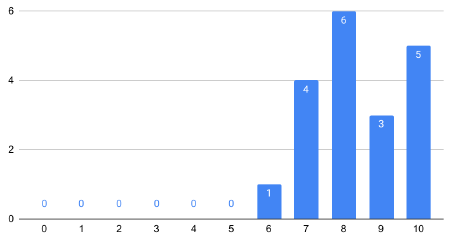
So what did the distribution of responses look like, to land me a total score of 36.8? Here’s the distribution graph:
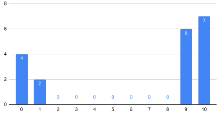
13 responses of 9 & 10 for 68.4% “promoters”, and 6 responses of 0-6 for 31.6% “detractors” gives me a polarizing NPS score of 36.8.
Actually, I jest. My NPS score was 36.8, but the responses were not polarizing at all. The calculation is just weird and obscures any valuable information. Here’s the actual distribution of responses:
8 responses of 9 & 10 for 42.1% “promoters”, and 1 response of 0-6 for 5.3% “detractors”, and 52.6% “neutral” gives me a very non-descript NPS score of 36.8.
Looking at the chart, one could easily be justified thinking “It looks like everyone feels positively about The Daily Commit”.
But of course, I didn’t just ask for a raking. I also asked the prescribed follow-up question:
What is the most important reason for your score in the last question?
Fewer people answered this one—only 12. And most answers touted something the reader thought was positive about the list, which helps to strengthen the impression that everyone feels positively about The Daily Commit. But one response stood out. I didn’t check how this respondant answered the 0-10 question, but their explanation was interesting, and really points to one of my main problems with NPS:
I seldomly recommend software development related materials to people.
PMF of The Daily Commit
So let’s look at the potentially more rigerous Product-Market Fit survey from Sean Ellis. It asks a similarly simple question, with four possible answers:
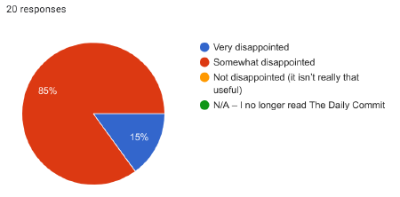
How would you feel if you could no longer read The Daily Commit?
- Very disappointed
- Somewhat disappointed
- Not disappointed (it isn’t really that useful)
- N/A — I no longer read The Daily Commit
The purpose of this survey is to gauge where the product (my daily mailing list in this case) has reached “product market fit”. And a score of 40% or more answering “Very disappointed” is considered the success metric.
So how did I do?
As I mentioned above, I scored 15%. 3 respondants out of 20 answered “very disappointed”.
Which is more useful?
Somehow that doesn’t feel nearly as reinforcing as the “good” NPS score of 36.8. 15% score when I wanted 40% sounds like a failure, whereas the NPS score feels like a modest success.
So which is actually more useful?
Well, I’d venture a guess that the PMF is more useful to me. Why? Well, my goal is to provide meaningful and valuable content to my readers. Only 15% of my readers say they’d be “very disappointed” if I stopped producing this list. So it sounds like I have work to do.
If I only looked at the NPS score, I might feel like I “had made it”, when in reality, I probably haven’t.
A diverse readership
I also asked my readers for their job titles, and got a wide variety of responses. I may dig into some more insights in a later post, but for now let me summarize with this chart:
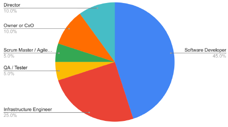
Although software developers make up nearly half of the respondants, the other half is incredibly diverse, ranging from owners and CxOs to IT directors, QA analysis, and Scrum Masters.
It’s hard for me to imagine a single daily mailing list that the average person in each of these roles would be “very disappointed” to see go away.
What’s next?
So where does that leave me?
I’m not sure.
I don’t have any plans to drastically shake things up. I probably will do a bit of soul searching to decide which audience I think I’m best suited to help, and over time I may try to tailor my content to that audience.
If that means some of this content becomes less useful to some of you over time, I do apologize. But we can’t be everything to everyone all the time.
For now, a genuine thanks to everyone who responded to the survey!