What is a Wardley Map?
How to map a value chain, along two axes: evolution versus visibility.I’m finally reading a book that’s been on my list for a long time: Learn Wardley Mapping.
I’m finding the book to be quite profound. As I guess have many others, since the topic keeps popping up more and more on social media and podcasts as of late.
What is a Wardley Map?
In a grossly over-simplified nutshell, it’s a map of components in a product’s value chain, along two axes: The maturity or evolution of the component, versus its visibility to the consumers of the product.
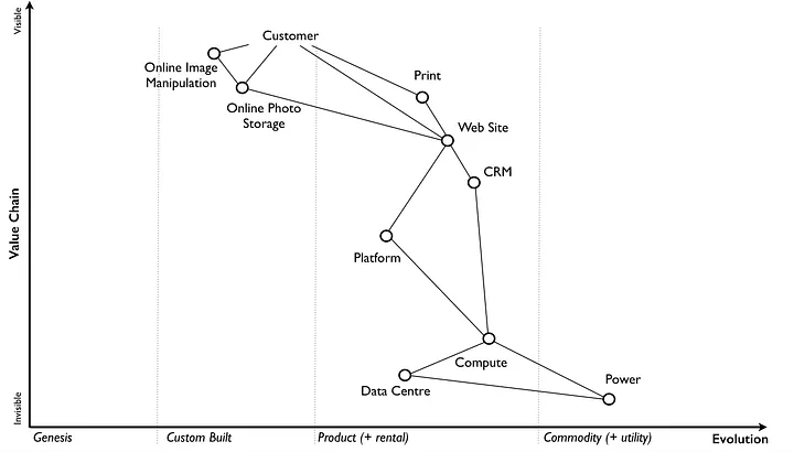
This visual representation of a product’s value chain can help with the analysis of many aspects of the business, which I expect to discuss in greater detail in the future.
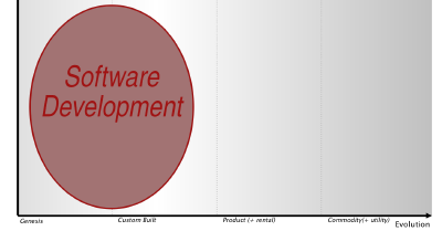
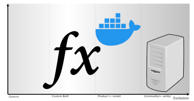
But for now, I want to just point out one salient feature of this type of map, and that is the labels along the X axis. As we move from left from right along this axis, we see Genesis, Custom Built, Product/Rental, and Commodity/Utility.
According to Simon Wardley, inventor of this mapping technique, every product moves along this axis from left to right. Not all ever move all the way to the right, but they all start at the left, in a state of complete uncertainty.
As an exercise, think of whatever product you’re most recently working on. Maybe it’s a microservice. Maybe it’s a SaaS. Maybe it’s a birthday cake.
Now pick one element of this product. The logging library used in your microservice. Or the cloud provider hosting your SaaS. Or the flour in your cake.
Where does this product fit along that evolutionary axis? Unless you’re building a highly experimental microservice, SaaS, or cake, probably closer to the right hand side. It’s probably a product or even a utility. Or if you wrote your own logging library or ground your own flour, then it’s custom-built.
Do that with a couple other components or dependencies. The oven you’re baking in. The gas or electricity (or firewood) that heats that oven.